Describing Inside the Box from Outside the Box
Campbell’s Corner – By Dick Campbell
This is a fun article. It brings back memories of a presentation 15 year ago to the Acoustical Society, titled “On the Presentation of Large Amounts of Room Acoustic Data”, [1] where I showed displays that are visually comprehensive and revealing.
Luckily, I had two enthusiastic students who were interested in acoustics and needed a project. I also had a 507-seat fan-shaped auditorium (in my home town) that needed some attention. This auditorium worked well for speech, but was a disaster for music, which was becoming a more frequent use. The students mapped out a plan of spatial data acquisition and took the MLSSA data in one day in the unoccupied auditorium.
The problem of presenting these data in a meaningful way became apparent just holding onto the pile of MLSSA printouts for room acoustic parameters. The students turned in a good report, if you like being buried in numbers, and got credit for their efforts. But the “meaningful display” issue continued to bother me.
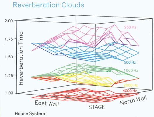
I used the engineering plotting program, Axum [2], quite a bit. I thought first of a simple contour map of reverberation time (T60). Then I realized that Axum could do 3D contour maps and further that the contour map itself could be elevated above the plotting “ground”. This resulted in a “cloud” floating in space but at a calibrated height. Then I thought that the contour map of T60 at different octaves could be represented all at once by simply changing color. Also, since the average T60 for different octaves is apt to be different, the clouds would float at different heights and be easily distinguished.
After entering the grid X-Y position and the corresponding T60 data, I created Fig. 1. I call these “Reverberation Clouds”. Note the T60 scale is 1 to 2 seconds, therefore the 4000 Hz cloud is slightly below the ‘ground’ plane. Note that any figure that says ‘house system’ means the excitation was from a single bi-radial horn over the stage. The phrase ‘test system’ means a dodecahedron on the stage.

Figure 1 - The underside of a cloud, if visible, appears in a different color. At 2000 Hz, for example, the yellow under surface turns red. At 250 Hz the under surface turns violet.
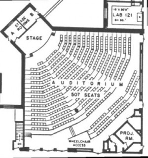
It’s time to clarify the geometry of this space. This auditorium, Fig. 2, is a box, 60ft square, 16ft high, with the stage at one corner and raked seating. The audience floor is thin-shell reinforced concrete with carpeting in the aisles. The elevated stage is also thinshell carpeted concrete. The stage box is a shallow rectangle. The plan view, Fig. 2 identifies the lo-cation of the test microphone by row, seat number.

Figure 2. Plan view of the test auditorium -- essentially a 60 foot-per-side box with the stage jutting out of one corner. The floor is raked about 2.5 ft to the rear cross aisle.
Referring to Fig. 1, notice that the T60 at 250Hz droops toward the side walls. After seeing this, I went back to the hall, and banged on the sidewalls with my fist: b-o-i-n-g at some low frequency. A drum head. Plenty of low frequency absorption could explain this behavior. Notice that this particular plotting program changes the color of the cloud when you are looking ‘up’ at the underside. You can see this effect in all except 1000Hz (green) and 4000Hz (red).
Next I thought about STI. I remembered Smith charts and how they combined matrix data, so I tried a few things and finally used a circular plot where the MTF value was plotted against each envelope frequency with a different color for each octave band. Voila! An “STI flower” (or MTF flower) as seen in Fig. 3 for seat E12. Each radial division is 0.2 MTF and half the circle is one system. That means the other half circle can be used to compare another system. It’s clear from Fig.4 that seat J01 has lower STI.
The ideal STI Flower is when the plotted lines lay at the diameter of the circle, e.g. MTF=1 everywhere in the matrix. As the flower closes in and gets ‘choked’ we have a problem. Even an architect might understand that one! Of course, it is necessary to discriminate the octave bands by trace color.
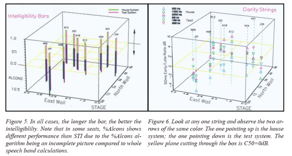
Next, I experimented with “Intelligibility Bars”. I set the ground plane in the center of the box, and grew STI bars above, and 100-%Alcons bars below, this plane. In Fig. 5, I show two locations in different bar colors. In each case, the longer the bars the better the intelligibility.
Finally, I constructed “Clarity Strings” where strings are stretched between box top and box bottom and colored arrows are hung on the strings based upon C50 data, from -6dB to +6dB. C50 is closely connected with speech intelligibility [3].
Such 3D images can be oriented at different view angles, and if the graphics program can export in OGL (Open Graphics Language) then these view manipulations can be done with a mouse. Obviously, many variations are possible, and my simple figures can be improved.
Back to 1992: the meeting room was poorly ventilated and standing room only. I was astonished to see many of the leading architectural acousticians of the day sitting there waiting to hear what I had to say. I guess everyone wrestles with graphics that attempt to tell a complicated story to the unwashed.
All it takes is a little imagination and a modicum of knowledge about how we see things. No need to be scared of presenting a large room acoustic data set. dc
References
[1] Salt Lake City, May, 1992
[2] A component of Mathcad, from PTC: www.ptc. com
[3] C50 as a Measure of Speech Intelligibility, Syn-Aud- Con Newsletter, Spring 2000


